Colour in print
Colour is a vital part of design and print. The colours you choose have a big impact, arguably the biggest impact of any aspect of your design. If you have some, you should use your brand colours to reinforce that all-important brand identity we covered in our B for brand identity blog post.
The colours on your print products should represent your artwork faithfully and be true to your brand. Sounds simple enough, right?
Unfortunately, there are a few things that can trip you up when it comes to colour and print. The world of colour can be complex, so we’ve broken it down to make it super simple when you’re ordering from us.
CMYK and RGB – what’s the difference?
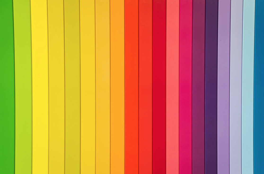
Most digital devices render colour using the RGB (red, green, blue) colour model. This model uses reds, greens and blues in different combinations to create every imaginable colour. The RGB model is additive, which means it makes other colours by combining red, green and blue.
CMYK (cyan, magenta, yellow, key) is subtractive which means it’s the opposite of RGB. Key is just another word for black. The CMYK model works by partially or entirely masking colours on a lighter background. The ink reduces the light reflected, which is why it’s called a subtractive model.
Colour in design
Designers have almost infinite control over the RGB colour intensity of each pixel in a design – they can alter the colour values precisely to control the tones. Higher values mean brighter colours, like letting more light into a room.
If you design your artwork on your computer, it’s likely you’ll be designing it and viewing it on a monitor using the RGB model. If you’re designing for digital and your design will be displayed on-screen, then the artwork will remain in RGB. But, if your design is destined for print, you’ll need to convert it to CMYK. Professional printing companies use CMYK because it’s the standardised colour model used by printing companies worldwide.
When you send your artwork off to be printed, the colours might look a little different to the design you created on your screen. RGB images look brighter than the CMYK printed version. This is because CMYK and RGB are different colour models and represent some colours slightly differently. Converting from RGB to CMYK can really affect your print product, as it impacts the colour tones. If your brand colours aren’t quite right, it can make your brand look less professional.
You can avoid this problem by making sure you convert your RGB designs to CMYK before they go to print. You can preview how your RGB design will look when converted to CMYK on your computer. We’re always on hand to make sure your designs are converted and set up to produce the best results.
Are there alternatives to using CMYK?
Yes – spot colours can be used instead. These are coded colours that would appear the same regardless of the colour spectrum you’re using. Each shade has a different code so the codes can be used to find an exact colour match. Spot colours are also needed for colours that can’t be created by RGB or CMYK like metallics or neons. The most popular spot colour classification is from Pantone.
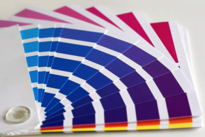
Pantone is the global authority on colour, forecasting colour trends for fashion and providing expertise on the psychology of colour. They started off in the 1950’s as a printing company and now has the widest range of spot colours available.
If you’re not sure about any of the technicalities of colour, just ask us – we’ve been handling colour in print for years so we know exactly what we’re talking about. We can make sure your colours are printed perfectly so your brand looks consistent.
In case you missed it, take a look at our A-Z of Belle design and print terms. Next up, we’ve got D for digital printing.