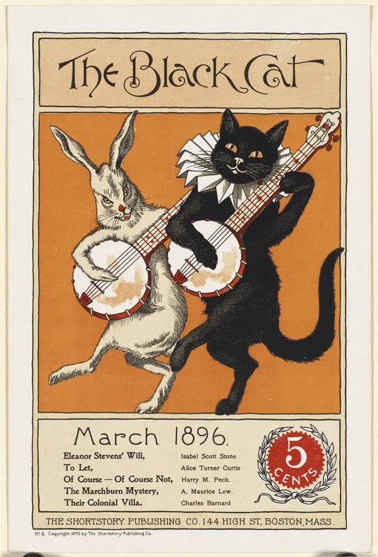
This month we’re talking about hierarchy and no, it’s nothing to do with your boss. We’re talking about it in a visual sense. If you’re not a designer, visual hierarchy might not be something you’ve ever come across before.
Understanding it can give your design real impact and allow you to influence the order in which someone reads your poster, business card or flyer. This means you can make your print more impactful, memorable and user-friendly.
The elements of your design at the top of the hierarchy aims to grab attention first.
Read on to learn the principles of visual hierarchy and how you can put them into practice, guiding your readers’ eyes to the most important parts of your design first.
BLUF
It’s a bit of marketing jargon that means ‘bottom line up front’. Attention spans are short – make sure your most vital message comes across first. The most important message or element of your design needs to be the focal point (at the top of the visual hierarchy).
If you were designing a flyer or poster for a gig, the name of the band, venue and date would be the ‘bottom lines’ you’d want to emphasise and have ‘up front’. The more minor details about the gig – ticket prices, timings and supporting acts don’t need to compete for the headlines attention. They can be less impactful, as you don’t need for them to be noticed and read first.

How we read
When we scan a piece of writing, we don’t read left to right, line by line. If we’re scanning a body of text we scan in an ‘F’ pattern – going along the top then through the text searching for keywords in headings.
If we’re scanning something less wordy without block paragraphs, we tend to scan in a ‘Z’ shape. If you’re designing a piece of print with text, you can use these principles to place your words where they’re most likely to be read.
Negative space
If you want an element of your print to stand out, give it space to breathe. Leaving ample white space gives your design a cleaner, more balanced look and gives extra power to the content on the design.

Size matters
One of the simplest principles of visual hierarchy is size. People tend to read the big stuff first. That’s why titles are often larger, and headings, subheadings or other important information is larger or bolded-up.
It’s true for pictures too – the biggest image will usually be at the top of the visual hierarchy, unless you use colour or boldness to override the size hierarchy. Use size contrast to your advantage and use scale to play up the most important elements.
Fonts
Some fonts are just more eye-catching than others. Using a heavier font communicates to the reader that the words are more important. Using interesting or distinctive fonts alongside plainer ones will put the words in the more interesting font higher up in the hierarchy.
Uppercase text has a big impact, so if your design is short on space, you can use capitals or heavy fonts to get that visual pay-off without taking up too much room.

Colour and contrast
Brighter, bolder colours are higher in the visual hierarchy than more muted tones. Splashes of strong colour command attention, so highlight the most important parts of your design with bright hues to make them pop. Use colour wisely though. Using too much can take the impact away from your most important elements.
Use contrast in your design to establish visual hierarchy with colour, font, size or alignment – the possibilities are endless.
Texture
Layering your design is a great way to give it visual impact. Giving white text a bold background is a simple way to add texture and influence the visual hierarchy.
Words with a background that make them ‘jump out’ of the page more will be higher up in the visual hierarchy than others. You can experiment with texture with graphics as well as text, to achieve ‘depth’ in your design.
Get wavy
Break the grid and set your design on fluid waves and curves. It’s more visually interesting than design based purely on square lines. To draw attention to a part of the design, set it at a contrasting alignment to the rest of the artwork.

Easy does it
Remember that to establish a visual hierarchy, less is more. Introducing too much visual emphasis will mean that no element of your design stands out. Use accents and colours wisely and sparingly to establish a clear visual hierarchy.
We’ve got years of both design and print expertise behind us and visual hierarchy is just another way we can help your designs work hard for you. Get in touch to chat about your next project and how we can maximise its impact.

